PROJECT: One Half

ROLE: UX, UI, Development

DURATION: Oct – Nov 2020

The Challenge

The challenge was to translate a successful social commerce brand into a scalable e-commerce platform poised for international expansion. The goal was not just to build a store, but to design a digital ecosystem that would formalize operations, optimize for conversion, and maintain the core brand essence customers loved.


Key Elements

  1. Simple & Effective Experience: Design intuitive, low-friction flows that guide users to their goals.
  2. Strategic Content Relations: Implement cross-selling and discovery systems to increase average order value.
  3. Performance & Visibility (SEO): Optimize site speed and structure to enhance user experience and findability.
  4. Data-Informed Decisions: Track and analyze key metrics to iterate on design and validate business impact.

My Role

I led the end-to-end product design, acting as a strategic partner to the founders. My role encompassed everything from foundational user research and business strategy to information architecture, user experience (UX) and user interface (UI) design, and post-launch optimization based on performance data.

The Process

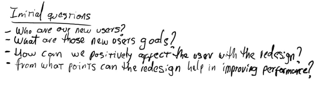
To ensure every decision was user-centered, we began with a strategic discovery phase. We developed data-informed user personas by analyzing their social media audience and conducting interviews, allowing us to validate hypotheses about their motivations and pain points.

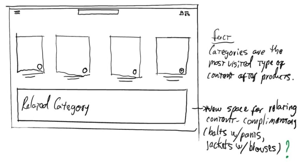
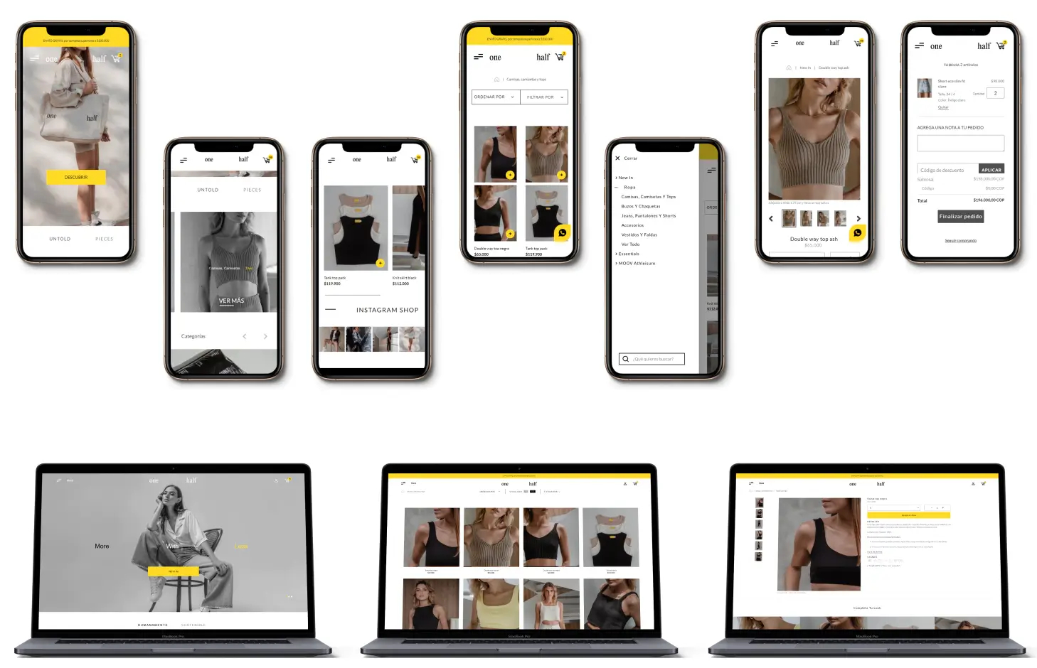
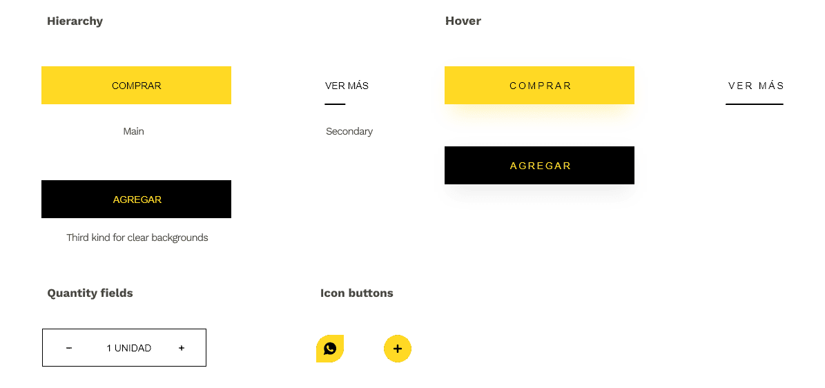
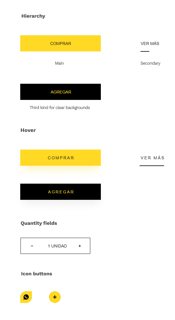
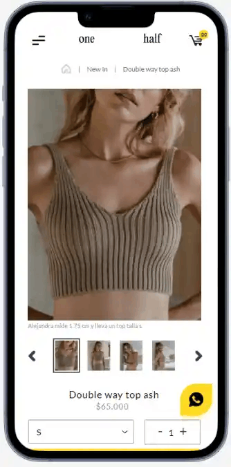
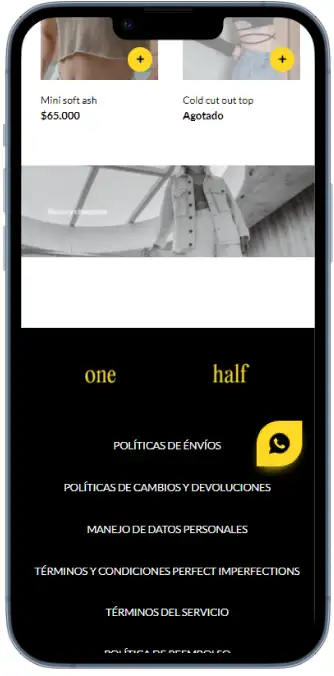
Based on these insights, I designed an intuitive information architecture and mapped out critical user flows—from product discovery to a frictionless checkout process—with the clear objective of minimizing cart abandonment and maximizing conversion.

The users

To move beyond basic demographics, we developed two key user personas based on data analysis from their Instagram community and qualitative interviews. This revealed two primary shopping mindsets: the “Impulse Buyer,” driven by trends and visual novelty, and the “Gift Seeker,” who requires trust, security, and clear navigation to make a decision. Understanding these motivations was crucial for defining design priorities, such as the need for strong visual impact on the homepage and clear trust signals during checkout.

Impulsive

Name: Alejandra
Age: 31
Occupation: Dentist

Alejandra is a dental health professional that her own practice, she is in the middle of building digital presence for her brand as a dentist mainly in social media, that is why she is always looking for outfits that go with the relaxed-chic style she wants to convey.

Seeker

Name: Diana
Age: 28
Occupation: Nurse

Diana works long hours at a surgery service, when the weekend arrives she doesn’t want to know anything about nursing uniforms, so she looks for comfort clothes that help her feel good about her body, she also works out at nights, for this she looks for sports clothes that help her battle cold weather.

Competitive benchmarking

I conducted a competitive analysis of national and international fashion brands that had successfully transitioned from social commerce to e-commerce. The benchmark focused not just on aesthetics, but on strategic functionality. I identified a key opportunity: many local brands neglected the post-purchase experience and communication around international shipping. This led us to prioritize a transparent order-tracking flow and to highlight global shipping options as a key differentiator from the outset.

Some of the key differences we found in comparison to our pretended experience were:

  • Excessive offer vs. Limited offer
  • Abundance of colors in key UI elements vs. Minimal UI.
  • Simple product relating vs. Deeper relating including categories.

Preparing the journey

By mapping the ideal customer journey, from discovering a product on Instagram to completing a purchase, we identified two critical friction points. First, a lack of detailed information on sizing and materials created uncertainty and abandonment on the product page. Second, any unexpected steps or unnecessary fields in the checkout process were a major detractor of trust, especially for an audience accustomed to the immediacy of purchasing via direct message

From Findings to Low-Fidelity Flows

These findings translated directly into the structure of our low-fidelity wireframes. To solve product uncertainty, the product detail page wireframe included, from the start, a prominent space for an interactive sizing guide and a “material details” section. To attack checkout friction, I designed a single-page checkout flow, eliminating unnecessary steps and ensuring shipping costs were calculated visibly and early. These initial wireframes became the functional skeleton to validate our hypotheses before investing time in visual design.


Final design

Style guide

Colors

Colores
Colores

Type

Fuentes
Fuentes

Buttons

Buttons
Buttons

Challenge 1

A simple and effective experience

The design focused on eliminating the friction of the manual Instagram purchasing process. We implemented a clear information architecture and intuitive navigation that allows users to find and buy products in a minimum number of clicks. Standardizing the checkout flow, optimizing for mobile, and presenting product information clearly transformed a conversational experience into an efficient self-service sales engine, increasing customer satisfaction and reducing the operational load for the team.


PRODUCTO

Challenge 2

Ampler product relating

To increase the average order value, a strategic product relationship system was designed. Instead of showing random items, we implemented sections like “Complete the Look” and “Customers Also Bought” directly on the product and cart pages. This cross-selling and upselling strategy not only improved the discovery experience for the user but also translated into a measurable increase in the number of items per transaction.

Challenge 3

A faster and more visible site

Exhaustive technical optimization was carried out, resulting in a substantial improvement in site performance. The Shopify performance score increased by over 30 points, which drastically reduced loading times. This improvement not only decreased the bounce rate and provided a smoother user experience but also had a direct positive impact on search engine optimization (SEO), increasing the brand’s organic visibility and attracting higher-quality traffic.

Challenge 4

Following important metrics

We implemented a robust Google Analytics setup to track key metrics that were previously invisible. Indicators like unique users, new users, session duration, and pages per session ceased to be abstract numbers and became the foundation of the business strategy. Analyzing these metrics allowed us to understand user behavior on a deep level, identify which products generated the most interest, and optimize marketing campaigns—transforming intuition into data-informed decisions that continue to drive growth.

Takeaways

This project was a powerful reminder that the most impactful product design happens when you act as a strategic partner. The biggest takeaway was learning how to translate the trust and immediacy of a conversational sale on Instagram into a robust and scalable e-commerce ecosystem, a challenge decisively validated when the store surpassed 1 billion COP (approx. $250k USD) in sales within its first eight months. It wasn’t merely about replicating a catalog online; it was about building an engine for data and analytics that empowered the founders to make informed business decisions. The project confirmed that successful design doesn’t end at launch, it truly begins there, by providing the tools for a business to deeply understand its customers and scale sustainably.